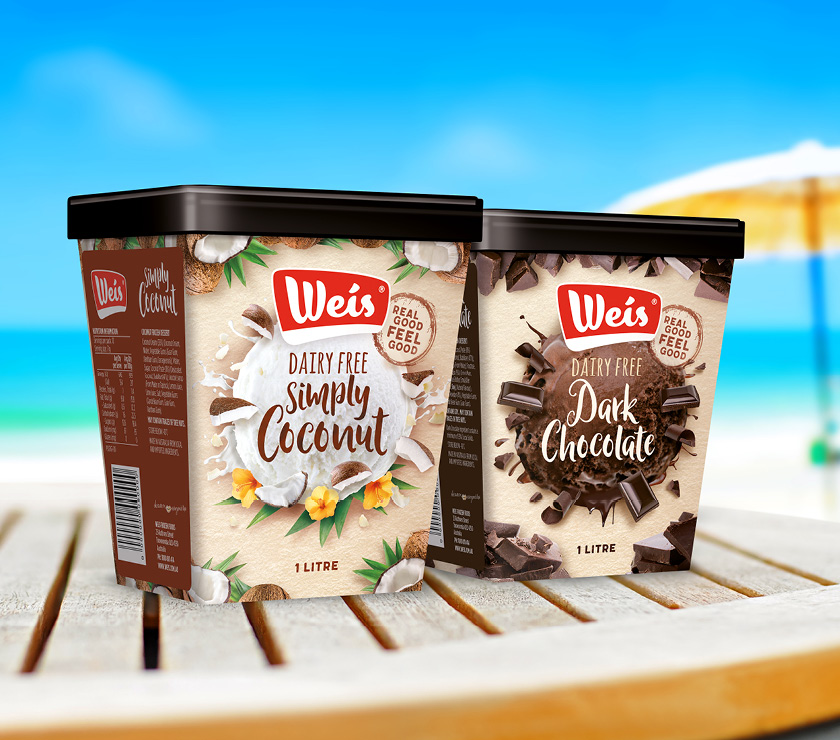
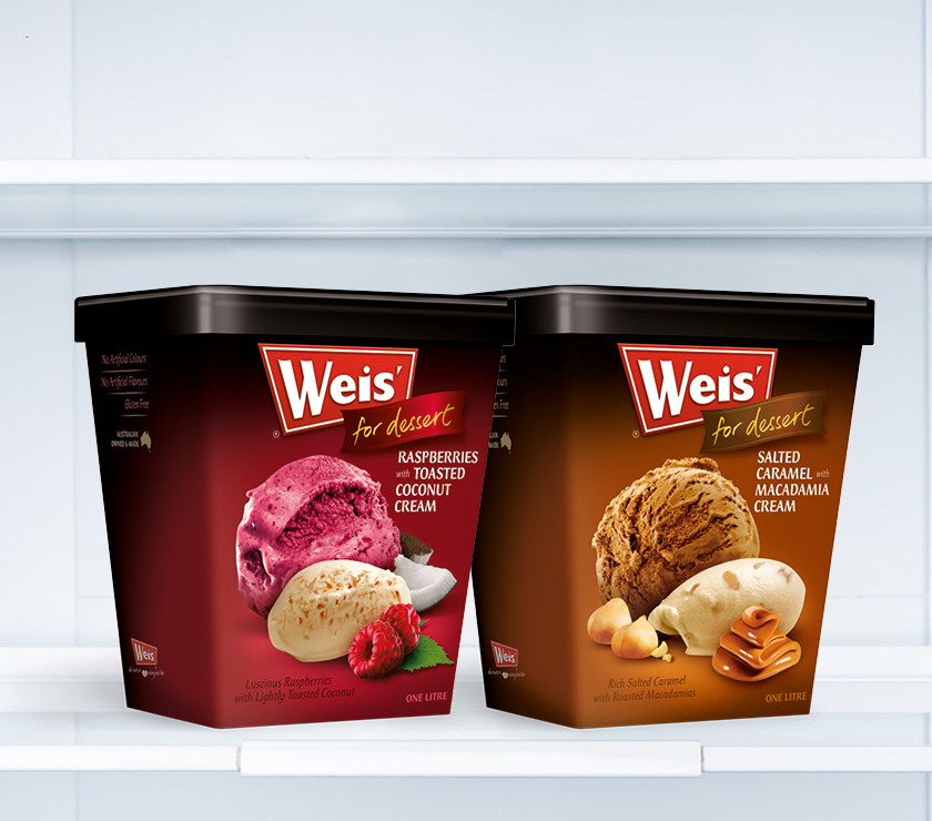
When Weis wanted to make the transition to a true take-home dessert — in a one litre tub, Nous recommended avoiding the off-the-shelf packs solutions already available. Convinced that greater brand presence could be delivered in their own unique design, Nous started work on designing a completely new shape of tub. Working with the unusual and slightly retro logo shape as a starting point, Nous developed a three-dimensional one litre trapezoid. With broad shoulders and a small footprint this new tub punches above its weight in shelf standout — sharp and detailed in-mould printing only adding to its appeal.
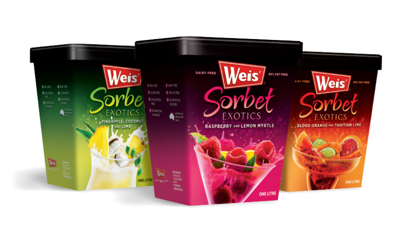
With a reputation for real fruit and real ingredients, Weis was ripe to launch a series of exotic sorbet flavours aimed squarely at the adult (read: cocktail) market. With some market intel that showed that the existing sorbet flavours were popular as mixers or bases for party drinks Weis decided to more boldly target that audience… without alienating the take-home-dessert buyer. Nous was involved from the start, contributing to the development of flavour profiles and naming. The design of the new “Exotics” tubs was based on the existing Sorbet range. The colours were darkened, made more intense — and extravagant, explosive photomontage images were created, each one splashing up out of a different shaped cocktail glass, hinting at their potential.
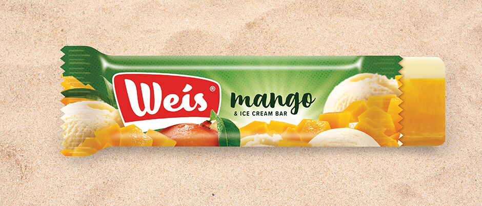
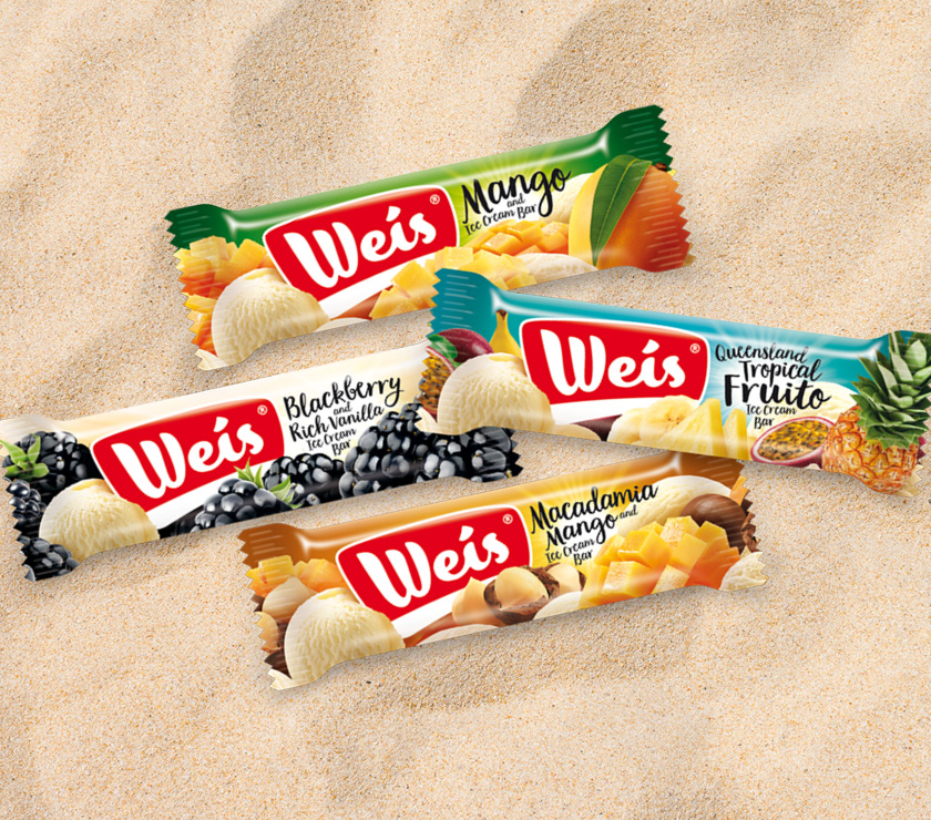
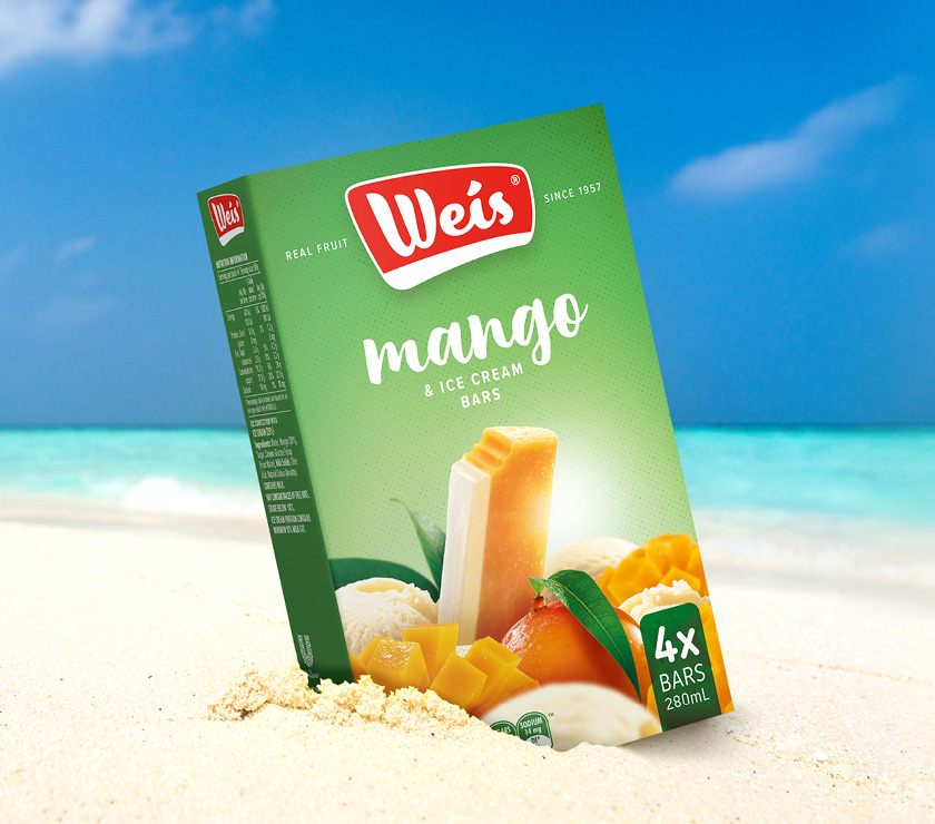
Weis has always had a singular presence with its angular and retro styled logo. Since its inception in 1957, there have been various subtle shifts in execution of the logo, but never a radical departure — for good reason. The strong recognition and subsequent equity afforded by the Weis logo could not be lost in any rework. Weis arrived at Nous with a concept for the refresh — include the iconic “cream strip” from the classic Weis Bar and soften the logo in the process. Nous designed a new logo that carefully mirrored the proportions and forms of the red and white in the existing brand — deliberately putting loyal customers at ease — whilst moving the typography and badge away from hard-edged and angular, instead crafting fresh, soft, more playful shapes. The new Weis logo feels like an old friend, it doesn’t seem too different, it can still be seen and recognised, but its new look will carry it well into the 21st century.