How to Test Your Website on Multiple Devices
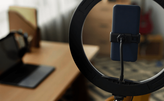
With the growing number of smart phones and tablets supporting various versions of operating systems and browsers, ensuring a website is visually optimised and functional across these platforms is a vital part of web development.
This blog goes into some detail explaining how we use emulators to test the devices in action while the website is being developed.

Mobile Websites Working as Intended
As mobile devices come in a number of sizes, operating systems and screen resolutions we need to test these variations to ensure the website is behaving as intended.
During the website development stage, resizing the browser window to the viewports that are relevant to mobile devices, testing the design break points is a sufficient technique for a quick visual check. When it comes to the testing phase of development we need to complete more in-depth checks.
Gestures such as finger swipes, tapping, pinch-to-zoom, changing between portrait and landscape are unique to mobile devices. Likewise on laptops and desktops there are hover events and mouse scrolling events and effects.
Emulators for Multiple Devices and Platforms
At Nous we use a combination of device emulators and physical devices to ensure our websites are robust across all major platforms. Device emulators allow our developers to interact with the website within a virtual environment, allowing us to test touch responses, design integrity and functionality.
Using a combination of IOS emulator, Android emulator (eclipse) and Google Chrome’s DevTools we test a wide range of mobile devices by:
- Emulating different resolutions and screen sizes.
- Evaluate site performance using a network emulator.
- Visualize and inspect CSS media queries.
- Simulate device inputs and responses for touch events and gestures.
- Allowing enough space for a suitable click area.
- Colours, shadows, and gradients are consistent.
- Font is rendered and easily readable.
- Graphics and images are crisp and clear.
Purchasing Multiple Devices
The alternate to testing in device emulators is to check websites on each physical mobile device. Incorporating testing methods such as device labs allow developers to test websites easily across multiple devices. Software installed on each testing device allows the device to mirror the actions of the web developer within the browser. This means a developer can easily navigate throughout the website on one device and have all other devices mimic the developers actions, inputs and responses.
Also known as synchronized cross-device mobile testing, this method is known to be more productive, however requires the purchase of multiple mobile devices.

Successful Browser Testing
Because of how far certain web technologies have come, such as HTML5 and CSS3, this allows web developers to utilise transitions, effects and layouts during the development stage.
Unfortunately some older browsers are limited regarding the functionality they can support. Not only does this impact the user, but also the web developer needs to develop the website with these limitations in mind. Some limitations can be overcome by using additional code libraries.
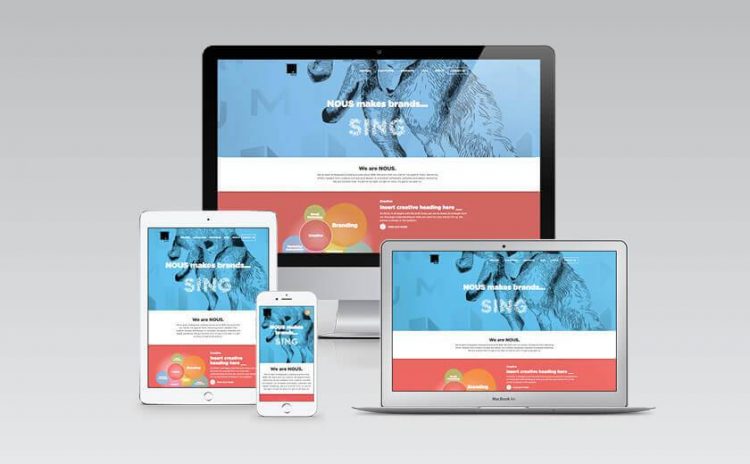
All users will still see the same layout, text and images no matter what browser they are using, however some animations, gradients or effects will not be viewable to some users. Testing on multiple devices and emulators provides the best opportunity to ensure that your site works with as many options as possible.
Mobile Optimised Websites
Mobile is becoming more important on multiple levels, as more and more users are browsing the Internet on their mobile device, and Google gives greater visibility to sites with responsive web design. It’s imperative that your website is visually optimised and functional for mobile devices, allowing you to reach a far wider audience with a high quality experience.
The increasing number of new devices entering the market with different screen sizes and resolutions, means that ensuring websites are optimised and functional across all devices is a key part to any website development.